
New tourism signage is going up! Keep an eye out in the coming weeks along the I-35 corridor and downtown at the Main Avenue boat ramp for these striking symbols of our growth and a look to the future.
Clear Lake Tourism Logos: Celebrating National Retro Day
Join us on National Retro Day as we delve into the history of Clear Lake’s tourism logos. From the charm of the 1949 design to the sleek modernity of the present-day emblem, each logo encapsulates a chapter in the story of this Midwest lake destination. Let’s explore the evolution of Clear Lake’s iconic logos.
1949: Iowa’s Vacationland Logo
![]()
Step back in time to 1949, when Clear Lake claimed its title as “Iowa’s Vacationland.” The classic logo features the iconic outline of the lake, adorned with points of interest that beckon travelers to explore its scenic shores. This timeless design laid the foundation for Clear Lake’s reputation as a premier leisure destination in Iowa.
1969: Introducing Captain Fun
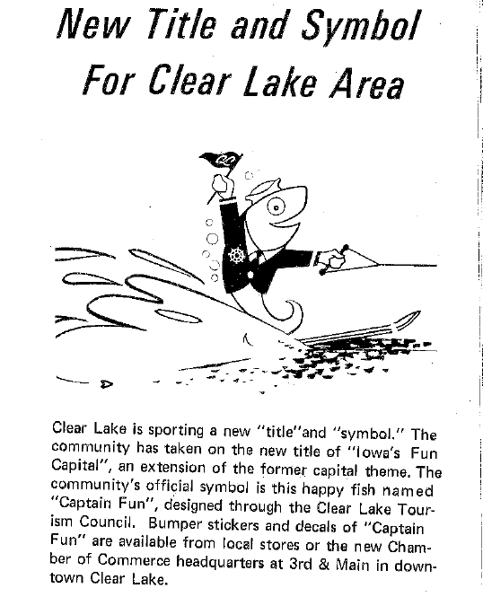
In 1969, Clear Lake welcomed a new mascot, Captain. Fun, with a logo that captured the destination’s playful spirit. Meet Captain. Fun, the charming fish in a suit jacket, waving a nautical flag to welcome visitors to Clear Lake’s vibrant community.
1981: Sailing into Colorful Waters
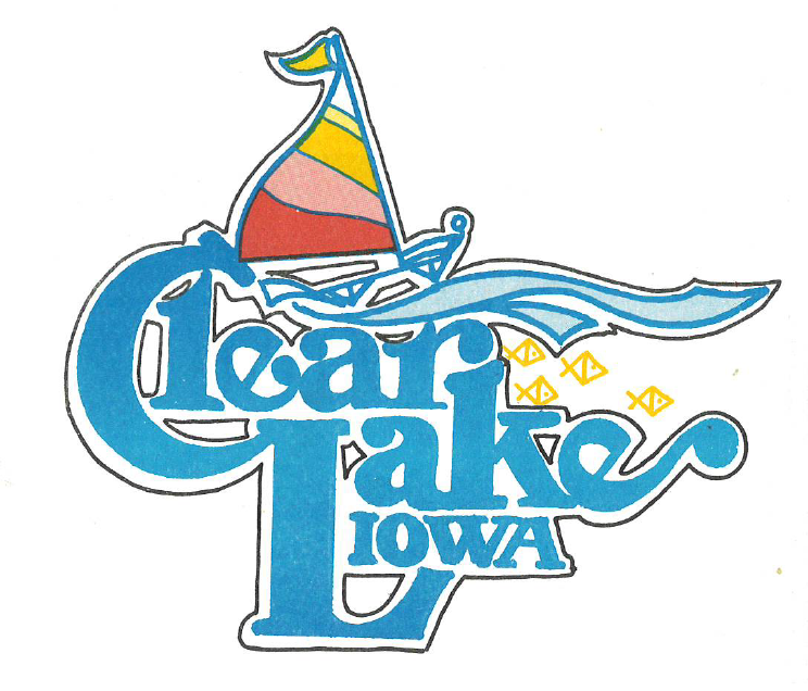
Enter the vibrant era of the 1980s, where Clear Lake’s logo underwent a transformation to reflect the essence of the times. Highlighted by large, outlined letters spelling out “Clear Lake Iowa,” the logo proudly proclaimed the destination’s identity with an unmistakable flourish. The colorful sailboat gracefully glided across the waters, symbolizing the boundless opportunities for exploration and relaxation that awaited visitors. But it was the hand-drawn fish that truly stole the show, injecting a playful energy into the design. With whimsical strokes, the fish danced across the logo, adding a touch of spontaneity and joy to the scene. Together, these elements formed a kaleidoscope of imagery that celebrated Clear Lake’s unique blend of leisure and adventure – eighties style!
1998: Cool, Classic, Clear Lake
![]()
As the new millennium approached, Clear Lake embraced a logo that epitomized its fun & timeless allure. Discover the 1998 design, adorned with the words “Cool, Classic, Clear Lake,” set against a backdrop of serene waters and a radiant sun. This emblem encapsulated the destination’s tranquil ambiance and enduring appeal to visitors seeking relaxation and rejuvenation.
2010: A Sunset Serenade
![]()
Nearly a decade later, Clear Lake embraced a new dock logo that exuded tranquility and serenity. Discover the 2004 circular logo, featuring a picturesque dock against the backdrop of a radiant sunset, casting a golden glow over the shimmering waters.
2024: Setting Sail into the Future
![]()
Today, Clear Lake’s tourism logo has evolved into a modern symbol of progress and innovation. Explore the newly launched sailboat emblem, representing both the Chamber of Commerce and the Tourism office. With its sleek lines and dynamic energy, this emblem symbolizes Clear Lake’s commitment to embracing the future while honoring its storied past.
Click here to view our 2024 Visitor Guide and plan your visit to Clear Lake, Iowa!
Explore our gift shop for Clear Lake souvenirs!
*Dates could be approximate. Historic logos are from publication in our s, not all of which had dates listed, so some logos could have been in use prior to the date listed.